Safety of Journalists
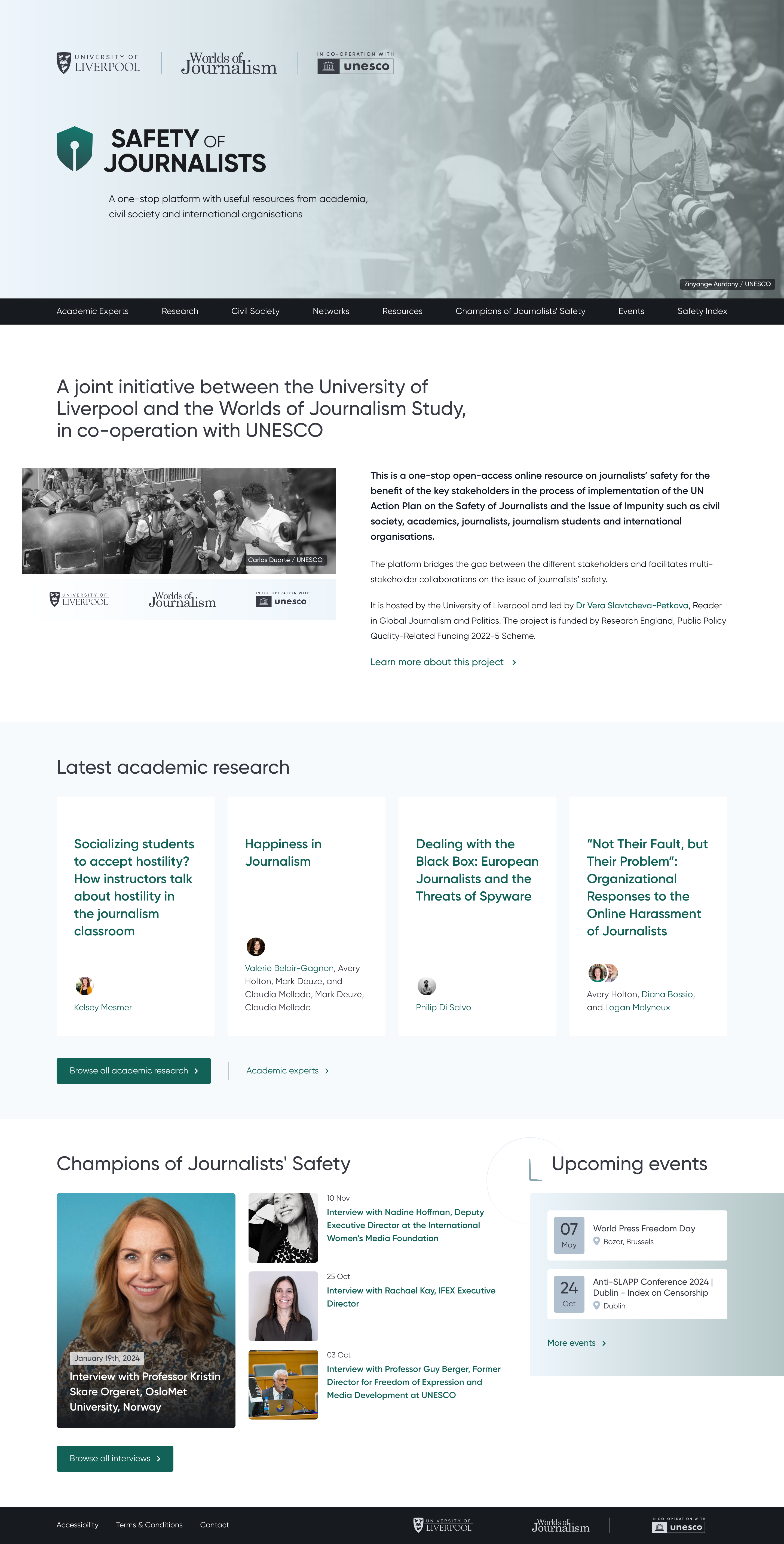
SafetyOfJournalists.org is an international research platform from the University of Liverpool, in co-operation with UNESCO. We designed and built it on Statamic and Laravel, then added the Journalist Safety Index: an interactive world map of the risks journalists face, country by country.
Client: University of Liverpool in co-operation with UNESCO
Sector: Press Freedom
Services: Strategy, Design, Development


A research hub and interactive index tracking the safety of journalists around the world, for academics, policy-makers and the public
Research on journalist safety, in one place
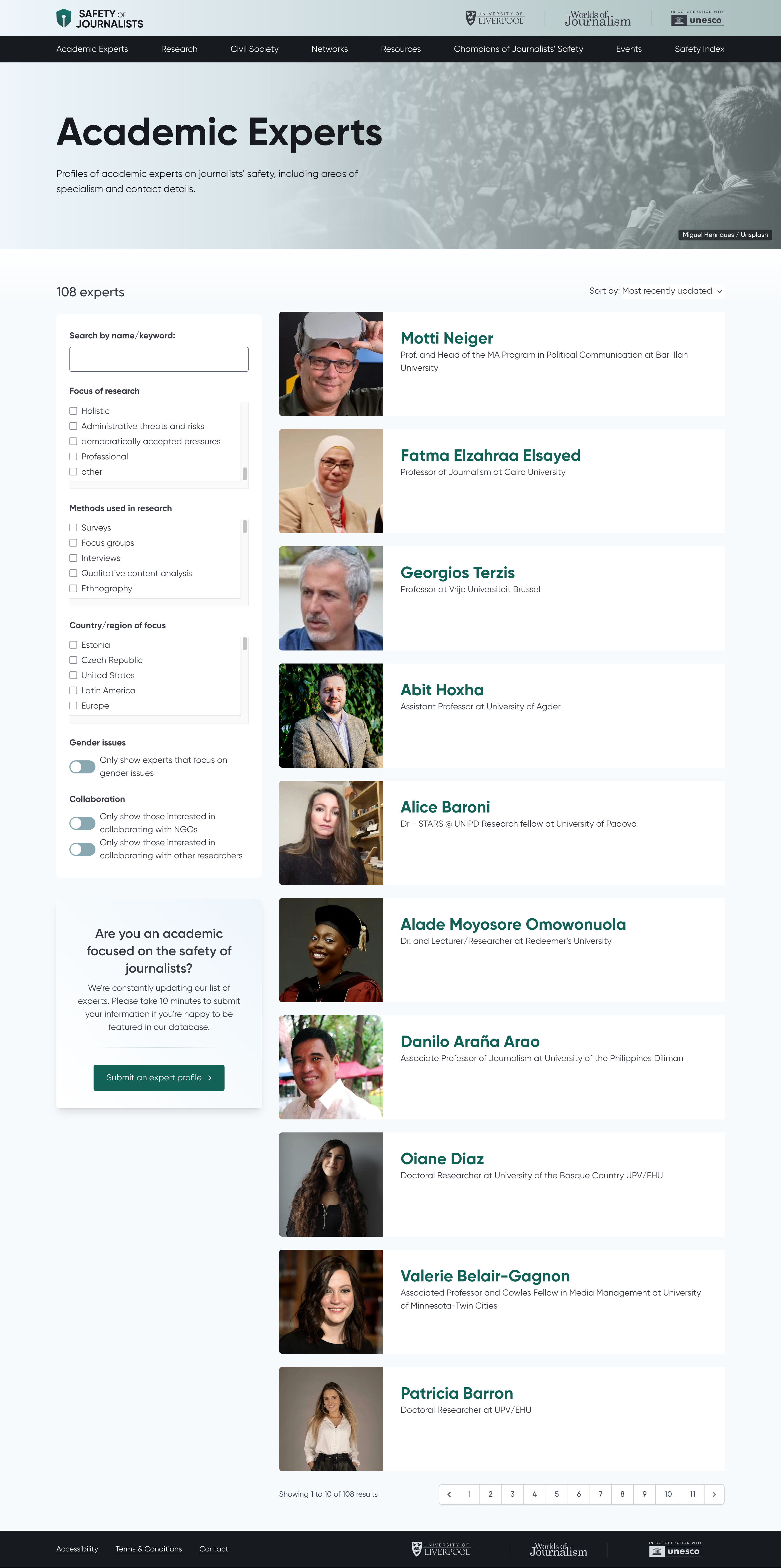
SafetyOfJournalists.org is an international project led by the University of Liverpool, working with UNESCO and the Worlds of Journalism Study. It’s where academics, civil society organisations and international bodies share resources, publish research and make the case for protecting journalists.
We designed and built the site from scratch. It had to carry academic weight and still be readable by someone who isn’t an academic. It runs on a flat-file install of Statamic, which makes it easy for the content team to publish anything from academic papers and policy reports to infographics and media. All the design and development was done in-house, with an eye on keeping the site usable, clear and easy to maintain for years.
The Journalist Safety Index
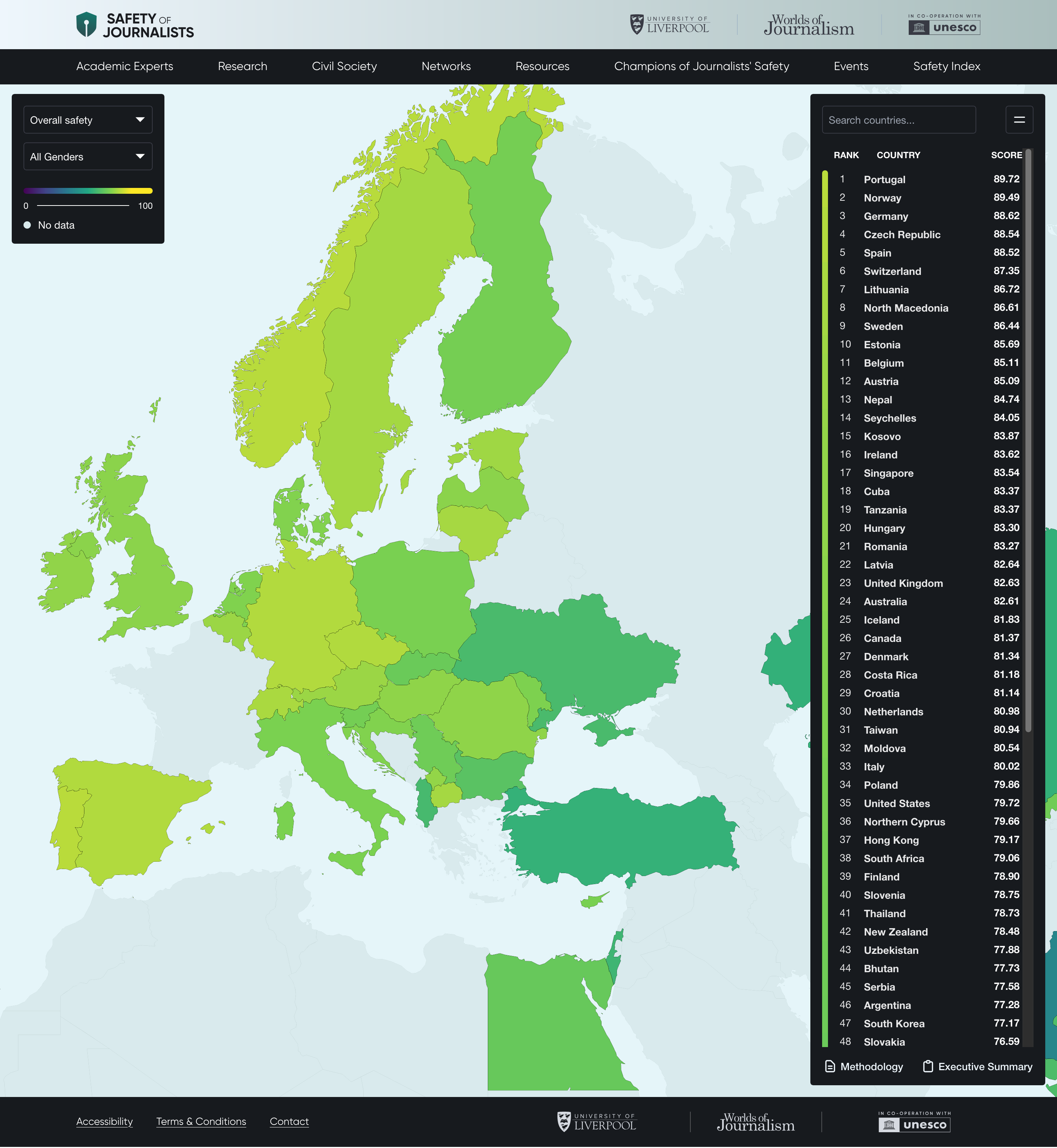
The most recent phase added something much bigger: the Journalist Safety Index. It’s based on survey data from tens of thousands of journalists around the world, and it lets you explore the risks they face in each country. The index runs on Laravel, with Eloquent looking after the data, and sits on top of the static site as a separate layer. That gave us the data-heavy features without weighing down the lightweight original.
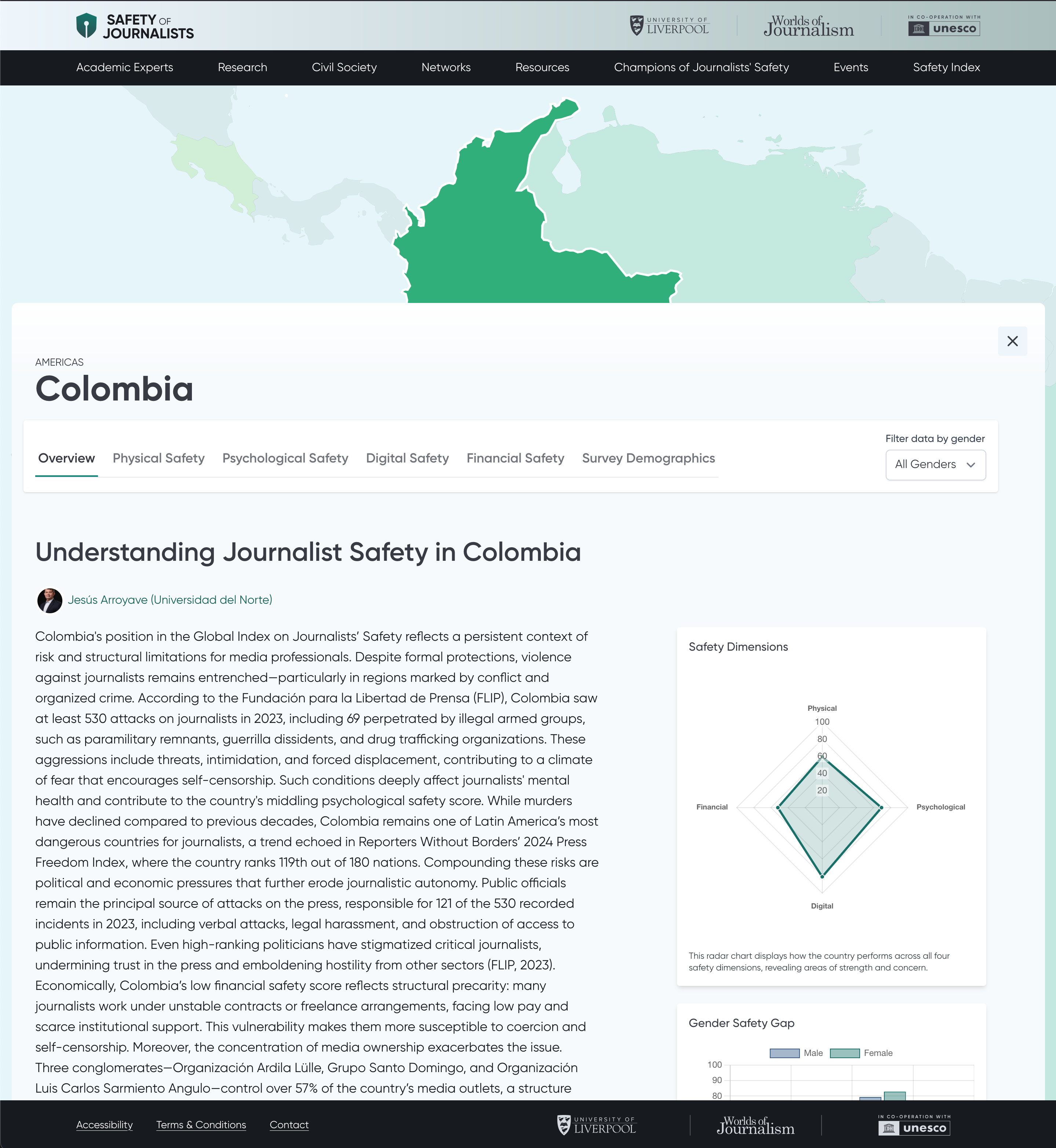
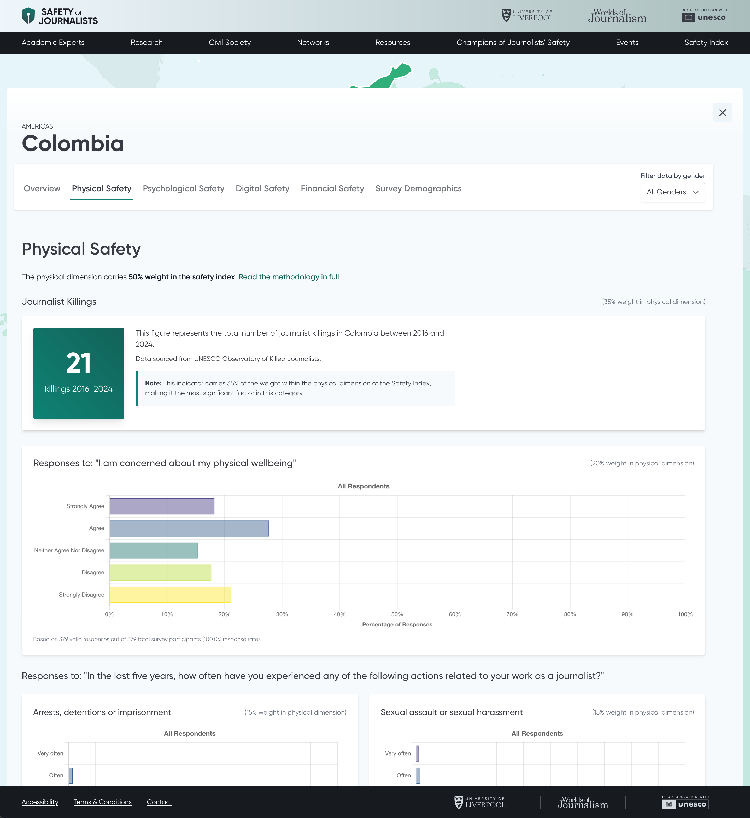
At its centre is a choropleth map, the kind where each country is shaded according to the data. We designed it around the Viridis colour palette, which suits this sort of visualisation very well, and built it with open-source GeoJSON data and the open-source MapLibre library. You can explore by region or country, then click through to a detailed report with charts of the survey data, context and comparisons. We designed and built all of it, from the way the map behaves down to the structure of the data underneath.
We still support the project, helping the University of Liverpool team and their international partners extend the platform and improve its tools as it grows.